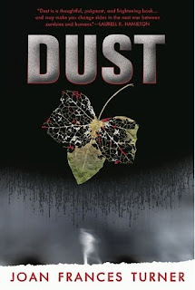
Today's book by its cover review is Dust by Joan Frances Turner.
Synopsis:
Nine years ago, Jessie had a family. Now, she has a gang.
Nine years ago, Jessie was a vegetarian. Now, she eats very fresh meat.
Nine years ago, Jessie was in a car crash and died. Nine years ago, Jessie was human.
Now, she's not.
After she was buried, Jessie awoke and tore through the earth to arise, reborn, as a zombie. Jessie's gang is the Fly-by-Nights. She loves the ancient, skeletal Florian and his memories of time gone by. She's in love with Joe, a maggot-infested corpse. They fight, hunt, dance together as one - something humans can never understand. There are dark places humans have learned to avoid, lest they run into zombie gangs.
But now, Jessie and the Fly-by-Nights have seen new creatures in the woods - things not human and not zombie. A strange new illness has flamed up out of nowhere, causing the undeads to become more alive and the living to exist to the brink of death. As bits and pieces of the truth fall around Jessie, like the flesh off her bones, she'll have to choose between looking away or staring down the madness - and hanging onto everything she has come to know as life...
Helena's thoughts:
I love this cover. The leaf is gorgeous and stuck in that limbo that all zombies are...between life and death, between green and crispy. The title is pretty nifty for a zombie novel. Although I don't really like the weird white fuzzy figure at the bottom; reminds me of the abominable snowman.
Oh lord! Can you imagine? What if the crazy yeti was a zombie?! I smell a wonderfully awful tongue in cheek story idea! ;p Looking forward to reading Dust and enjoying the top half of this cover.
Lily's thoughts:
Cover, schmover. This book is about ZOMBIES! Zombies may not hit the same hot scale that vampires, werewolves, and shifters (oh my!) do, but they are completely kick ass all on their own. They don't need to be hot. Why? Because they're fucking AWESOME, that's why.
Ok, now that I've gotten that out of my system. As for the cover, I'm afraid it doesn't really do much for me. As simple as it is, the images that are there conflict. I like the leaf, slowly disintegrating, because it speaks to the same process of life, death, and decay that all things experience, including zombies who take those steps a bit out of order. But then the bottom of the cover kills the symbolic imagery at the top. What is it supposed to be? Fog? Steam? Mist? Wind? Condensation on a shower door? I just don't get it and instead of adding to the simple yet powerful image of the decaying leaf, it detracts with its confusing nature.
Love the concept of the book. Can't wait to read about zombie gangs. Not a fan of the cover.


2 comments:
Did I actually review this cover a while ago? I don't even remember. I think I need a brain transplant...
You do and neither of us noticed the red spots on the leaf...prolly reminiscent of blood. Go us and our observation skills lol.
Post a Comment