

We're trying something new here at Vamps R Us, a weekly feature we're calling "Book By Its Cover Tuesdays", where we'll discuss a new paranormal release based solely on it's cover and what, if anything, we know about the series or author. We're interested in your opinion as well, so feel free to chime in.
The first book we'll be judging by its cover is new release Dead in the Family, the 10th installment of the Sookie Stackhouse Southern Vampires series by Charlaine Harris.

Synopsis:
After enduring torture and the loss of loved ones during the brief but deadly Faery War, Sookie Stackhouse is hurt and she's angry. Just about the only bright spot in her life is the love she thinks she feels for vampire Eric Northman. But he's under scrutiny by the new Vampire King because of their relationship. And as the political implications of the Shifters coming out are beginning to be felt, Sookie's connection to the Shreveport pack draws her into the debate. Worst of all, though the door to Faery has been closed, there are still some Fae on the human side-and one of them is angry at Sookie. Very, very angry...
Lily's Thoughts:
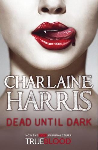
I've read the other books in the Sookie
 Stackhouse series, so I really have to work to distance myself from what I know of the series to judge fully on the cover alone. I like the series and I'm excited for this latest installment. That said, I love this cover. Since True Blood hit the airwaves, many of the original Sookie covers have been changed to tie the books in more closely with the show. While I'm a big fan of the show, I prefer the original book covers (featured to the right) over the True Blood promo tie-ins and the covers that bare stylized versions of Anna Paquin's face.
I like the cartoon quality of the covers, the depiction of Sookie in all her blond, innocent beauty, and the pale exteriors of the vampires. By using cartoon drawings, I think the original covers emphasize a specific piece of the story, a scene of importance, rather than simply conjuring an image of the actors playing the roles in the series. In so doing, I think these original covers are more likely to stroke the imagination and tempt readers into visualizing the scenes for themselves, rather than just forcing subconscious images of the True Blood cast through the hoops created by the narrative.
As for the Dead in the Family cover, I like the bold use of colors, the blues, greens and reds. I also like the symbolism of the rose, complete with thorns, and how it's separating Sookie and Eric even as they reach for each other. These two are going to have issues in the upcoming book, and this cover depicts that well. Overall, I give the cover a 5 out of 5. Excellent cover for what I'm hoping is an excellent book.
Helena's Thoughts:
Wow, pretty is my first thought lol. As I have already posted earlier, I am way excited for this release and I am along with Lily no stranger to this series by any means. I did realize earlier today that they are all running together though. Not in a bad way, I just can no longer separate individual novels out of the bigger picture anymore. At least Harris does a great job keeping the story flowing haha.
Team Eric is wonderfully represented on the cover. I agree with Lily, I do adore the cartoon covers. I think it lends a level of playfulness and lightheartedness to the content contained within. The rose looks like it will be sparkly! Hopefully the only part of the cover that will be, I prefer my blood suckers non glitterized. I find it interesting that two stems intertwine and culminate in the rose...maybe symbolic of the joining of two characters despite the "fang-ups" so to speak in their individual histories. I do hope so!
Gorgeous, simple, symbolic, perfect representation of the series...the designer of the cover makes another homerun. Can't wait to brave the thorns and delve into this one. 5/5 rating!


0 comments:
Post a Comment